

Do you have to create an impressive PowerPoint presentation? But the thought of having to come up with an interesting presentation design fills you with dread?
Let’s just say what needs to be said.
PowerPoint is a great tool. It can amplify and illustrate your message. It lets you add some supporting data, graphics, and even animation. Using PowerPoint also structures the information in the minds of your audience.
However, to be memorable, your PowerPoint slides should be well-planned and unique.
Don’t Think Slide Deck – Think Story
You have to wonder if all those pre-designed PowerPoint templates are actually doing more hard than good. The one thing you need to keep at the forefront of your mind as you put together your slides, it’s that your audience doesn’t want a slide show, they want a story.
Steve Jobs: “People who know what they’re talking about don’t need PowerPoint”
Think of your slides as a movie set designed to enhance your story.
Here’s a PowerPoint tip that has nothing to do with slide design — add rhythm to your presentation by spending more time on one slide than another. Then instead of putting a bunch of bullets on a single slide, beak them up into individual slides and roll through them quickly.
Tip #1: Choose a cohesive design.
The best way to get your message across is to use a simple, consistent and cohesive design.
That’s why this is a big no-no to style every slide differently. Presentations that have simple styling tend to stick and stand out.
A predictable slide design also lets your audience focus on the content rather than the artwork.
So, start out thinking of the presentation design before you actually get down to filling your slides with content. You can either adjust one of the default PowerPoint templates or go for the custom ones available on the net.
That way you’ll have a visually stunning presentation without bothering about modifying the template’s layouts, fonts and styling.
For example, check out the collection of PowerPoint templates of one of the largest web design marketplaces, i.e. TemplateMonster.
Don’t have MicroSoft PowerPoint? Don’t sweat it.
There are plenty of alternatives. Canva, Visme, Beautiful.ai and Google Slides are both free for the basic version.
They offer similar features compared to PowerPoint. Prezi is also gaining popularity in the business world. Though it’s a paid product, they do offer a free 7 day trial. You know we’re all about the freemium stuff around here.

Tip#2: Show, don’t tell.
When you add content to your presentation, keep in mind that it’s there to complement your main points.
Graphics, text, and stats will not tell the full story. Of course, if your slides are too text-heavy the audience will start reading your slides. They won’t be listening to you. Your PowerPoint presentation should be a visual aid, reinforcing your message as a speaker.
Slides shouldn’t feature walls of text or in-depth explanations. They should serve as an outline or highlight reel for relevant data.
And remember–don’t create slides that add no value to the presentation.

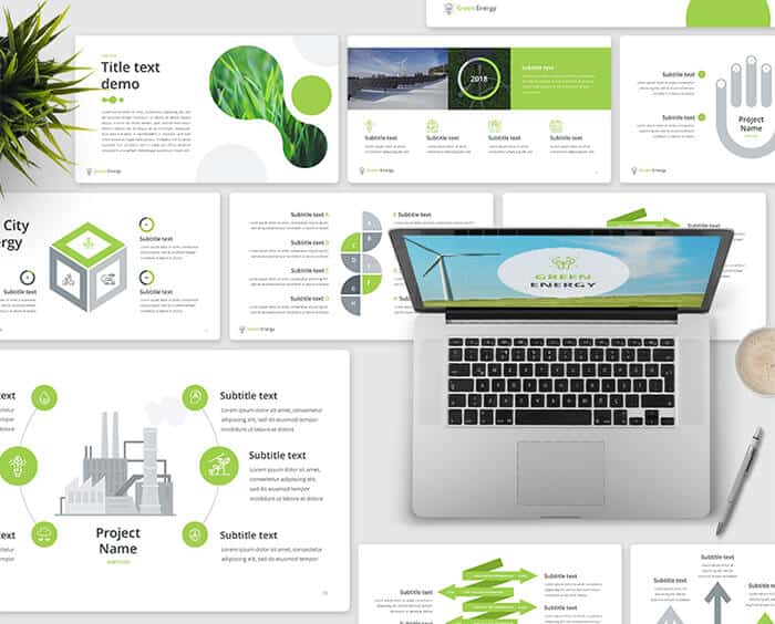
Tip #3: Go for infographics.
So how do you walk the line of too little information or a text overload? One word: infographics. PowerPoint is a tool that natively encourages you to create timelines, diagrams, mind maps, etc. Don’t be too lazy to create them.
Generalize and include a several points to cover into one mind map to show the relation and interconnection of the aspects. Mind maps like these work better than bulleted lists.
Project Report PowerPower Template
Tip #4: Ditch those bulleted lists.
PowerPoint makes you use bulleted lists by default. You should ditch those.
Try creating a mind map instead of a bulleted list. By doing this, your info will appear more modern and engaging.
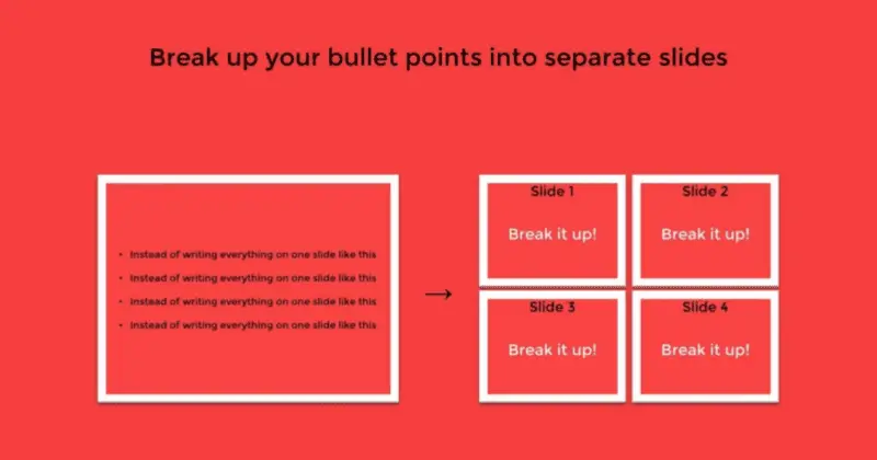
Want to cover every point of your bulleted list in a greater detail? Break up your bullet points into separate slides.
The less content you have on every slide, the more impressive you can make it. And the more likely your audience will remember specific points.
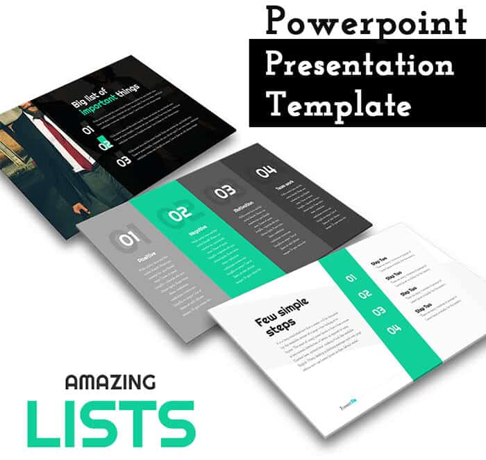
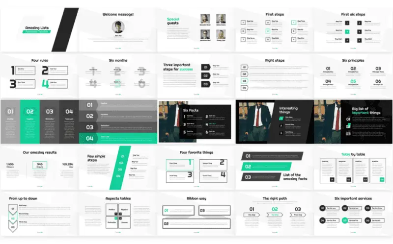
If you feel that a bulleted list is the best way to present your information, use the custom bulleted list style from the PowerPoint template gallery.
For example, the Amazing Lists PowerPoint Template is the one that brings you 20+ unique styles for bulleted lists that look just stunning. See them below:
Tip #5: Make your PowerPoint Presentation readable, even for those in the cheap seats.
Your presentation’s readability is a concern that you should forget. If reading the letters of your presentation is not comfortable from the back of the room, this can ruin the whole experience for some of your listeners. It’s recommended that you go for the font sizes above 28 px. If this doesn’t seem possible, consider breaking your slide in to a couple of slides.
Moreover, observe good contrast and make smart font choices. Keep in mind, that black font on white background gives you the highest contrast and the best readability possible. The runner up color combination for text and background is white text on dark background. For advice on font choice pay attention to the next tip.
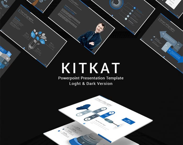
Light and Dark Version Template
Tip #6: Use visually engaging fonts.
Font is a powerful tool of PowerPoint presentation design. The right font choice not only makes the presentation text readable, but also grabs your audience’s attention. It makes them want to follow you and your slides.
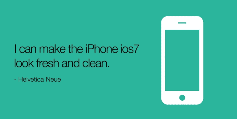
Some experts suggest that you forget the standard Microsoft office fonts, such as Times New Roman and Calibri and go for the ones that are more engaging. On the other hand, for the majority of your text you need a font that doesn’t distract the audience..
The best way to find the right font for your PowerPoint presentation is to check out the fonts that are currently popular in web design. These fonts are typically readable, minimalist, and creative. For example, one of the web’s most popular fonts that also works well for PowerPoint presentations is the sans-serif Helvetica:
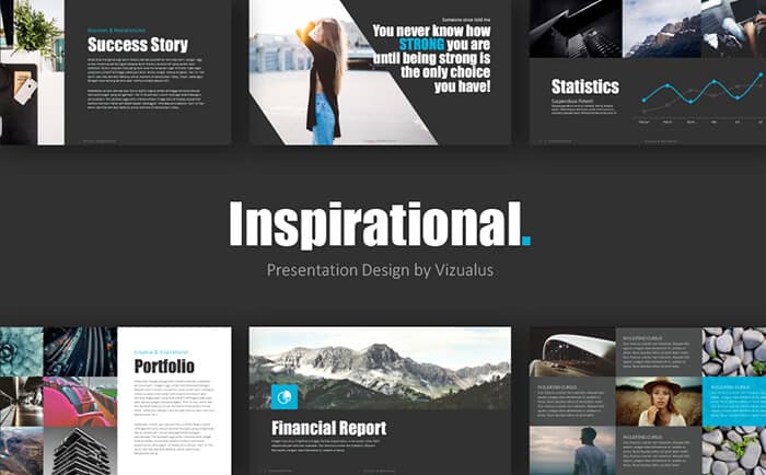
Inspiration PowerPoint Template is the one that uses the potential of smart font choice to the fullest. With it, your slide captions and titles look bold and attractive, and every single word of the presentation stays readable for every viewer.
Tip #7: Use bright visuals.
The first cornerstone of your presentation’s success is the use of well-delivered infographics.
The second one is the use of bright visuals. I’m not saying that you should turn your presentation into an Instagram feed, but a couple of nice pics should do the trick.
Go for high-quality images to create the mood of the presentation. This also allows your audience to have a journey-like experience with your PowerPoint presentation. Of course, images tend to catch people’s attention, so it’s wise to use them before and after the data-laden slides.
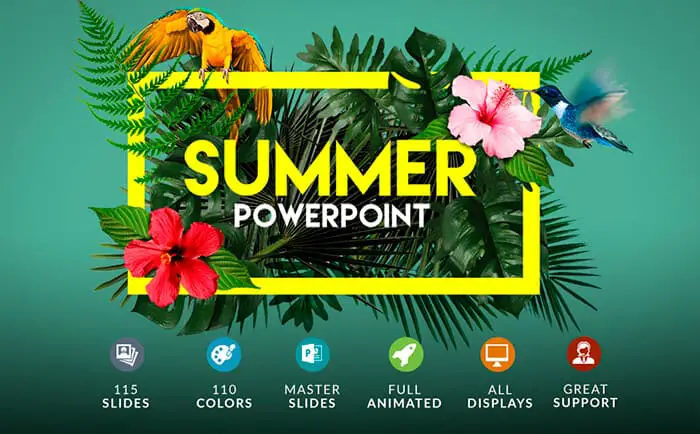
Don’t feel like wasting time searching the web for premium templates?, you can choose the PowerPoint template that comes with the premium imagery on board.
For example, the Summer Template comes with a thick pack of background/hero imagery for a traveling-related presentation that would make your audience wow:
Tip #8: Go for vibrant colors.
If you want people to attend to your presentation, you should make use of visually stimulating colors. Even if you’re delivering a presentation on serious matters, you shouldn’t miss your chance to highlight the main points with an accent color.
The bright colors to use are light blue, green, red, orange and/or magenta. Choose the one that best fits the design of your presentation and get the most out of your listeners with it. Do not hesitate to experiment with colors and try different color combinations to choose the one that best fits your PowerPoint presentation.
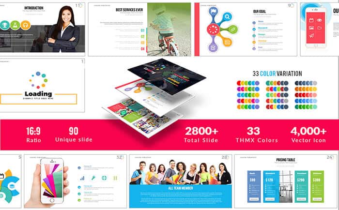
If you question the power of colors in presentation design, check the Loading PowerPoint Template below:
Tip #9: Make sure your design aligns with your content’s purpose.
It’s hard to give the generalized presentation tips as what’s appropriate in one presentation, would be absolutely out-of-place in another. That’s why, it’s important that you keep the topic and the purpose of your presentation in mind on every stage of creating your PowerPoint. The color palette, the fonts and the visuals of your presentation should play well together and amplify the message of your presentation.
For instance, if you create a business-oriented presentation, go for the minimalist design, white background and blue or red color accents. Minimize the use of imagery and work hard on your infographics.
On the other hand, if you want to create an artful PowerPoint presentation, handwritten fonts, beautiful imagery and pastel color palette would work perfectly.
Tip #10: Incorporate modern web design trends in your PowerPoint presentation.
Want to know a secret? To build a winning presentation you should reflect on modern web design trends. In a nutshell, what rocks online, rocks on your slides.
Keep your presentation clean and minimalist, trim off all the content you can live without and make it easy to digest.
What’s more, make sure you stick to the nice combination of content and negative space and use high quality media. If you stick to the principles of modern web design, your presentation is bound to wow the audience with its modern look and feel.

Wrapping Up
PowerPoint is a tool that lets you create striking presentations that are the masterpieces with matching color palette, layout, font styles and imagery. Many of us fail to pay attention to all these elements of a presentation. We view it as a subsidiary mix of bulleted lists and cheesy stock images.
If you want your PowerPoint presentation to be really effective, pay attention to its styling. Use readable modern fonts, craft infographics and incorporate modern web design trends into it. If you follow these 10 tips on creating an awesome PowerPoint presentation, you’re bound to make a lasting impression on your audience.
Are there any important presentation creation tips that we’ve missed? Let us know in the comments.

For bonus grab this Free eBook with 21 tips for your Presentation.
DOWNLOAD FREE
Stay tuned!