In This Article

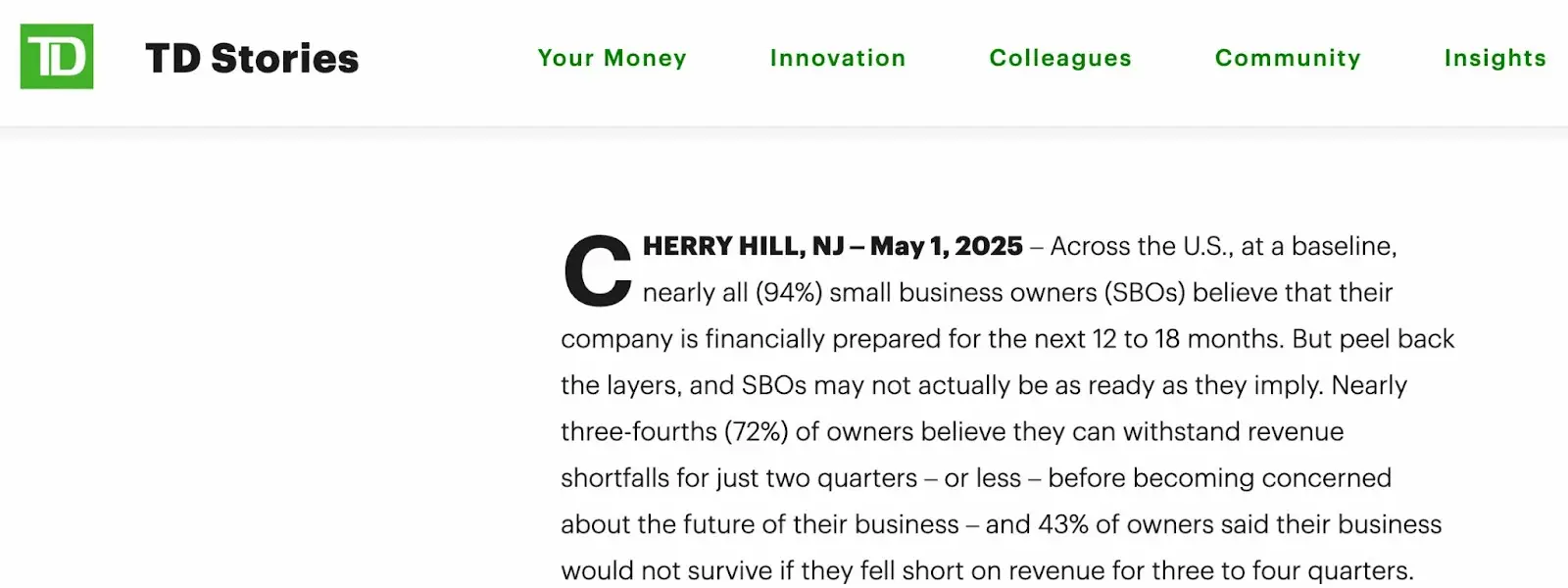
Picture this: You’re at your desk, coffee in hand, scrolling through the latest industry report. A bold headline catches your eye: “92% of Small Business Owners Report Strong Growth Expectations.” (Check sources like TD Bank’s annual small business survey for similar claims.)

You screenshot it, maybe even share it. It feels like validation. The market’s hot, opportunities abound, everyone’s winning.
But here’s the thing: that statistic is like looking at a single brushstroke in a Monet painting.
Sure, it’s part of the picture, but if you’re making strategic decisions based on that alone, you’re essentially navigating with a map that only shows one street.
The truth about survey data isn’t that it lies. It’s that it whispers truths in a language most of us never learned to speak. And in a world where every marketing decision seems backed by “data-driven insights,” understanding this language isn’t just useful. It’s survival.
The Survey Paradox That’s Costing You Money
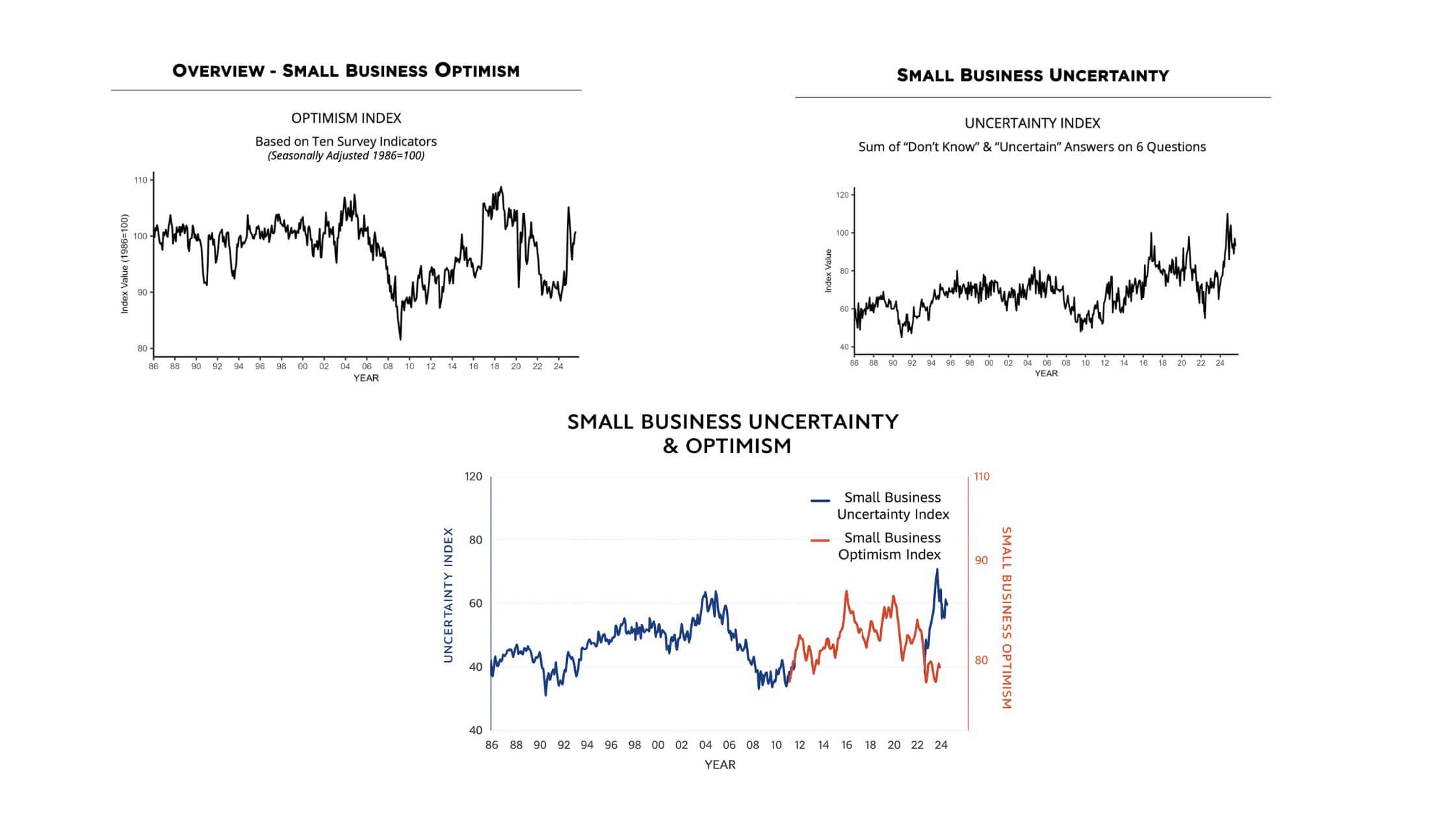
Take the August 2025 NFIB Small Business Optimism Index. A perfect case study in contradictory truths. The report shows the Optimism Index rising 0.5 points to 100.8, nearly 3 points above the 52-year average. Meanwhile, the Uncertainty Index fell 4 points to 93, but remains the 11th highest reading in over 51 years.

On paper, this looks like progress. But dig deeper and you’ll see the fascinating dance between hope and anxiety. The overlay chart from the latest data tells the whole story: while optimism (the red line) has finally broken above its long funk, uncertainty (the blue line) continues its volatile journey, creating an almost mirror-image relationship.
What the Chart Really Shows
Look at that overlay chart closely. From 2020 through 2024, optimism and uncertainty moved in opposite directions like a seesaw. When one went up, the other went down. But notice what happened in late 2024 and into 2025? The lines started moving together. Optimism climbed steadily above 100 while uncertainty remained elevated but volatile.
This isn’t confusion. It’s sophistication. Business owners are learning to separate controllable optimism (their business operations) from uncontrollable uncertainty (the external environment). They’re saying: “My business is solid, but I still don’t trust what’s coming next.”
Here’s what’s happening: Business owners are optimistic because they finally see light at the end of the tunnel. The Optimism Index broke out of its three-year slump below 99 and is now consistently above the historical average. But they’re still uncertain because they’ve lived through years of whiplash from external forces (supply chains, policy changes, economic volatility). Notice how the uncertainty line spikes and drops dramatically while optimism moves more steadily? That’s the difference between feeling hopeful about your business and trusting the world around it.
This isn’t a contradiction anymore. It’s evolution in real time. The August 2025 data shows business owners learning to separate what they can control (their business optimism) from what they can’t (external uncertainty). Decode that shift, and you’ve got marketing gold.
The Architecture of Deception (That Isn’t Really Deception)
Let’s start with an uncomfortable truth: every survey has an agenda. This isn’t conspiracy theory territory. It’s basic human psychology meets business reality.
The NFIB wants to advocate for small businesses. A payroll software company wants to highlight pain points their product solves. A marketing agency wants to demonstrate thought leadership.
This agenda shapes everything: which questions get asked, how they’re phrased, who gets surveyed, and especially which results make it into the executive summary. It’s not malicious. It’s just human. We all see the world through our own lens, and surveys are no different.
Consider how question framing changes everything. Ask “What’s your biggest challenge?” and you’ll get different answers than “What keeps you up at night?” or “What would you fix first if you had unlimited resources?” Each variation pulls different psychological levers, activating different mental frameworks in respondents. This principle is well-documented in behavioral psychology research.
Even response options matter. Give someone five choices, and they’ll pick from those five. Even if their real answer would be option six that you never offered. Multiple choice creates artificial boundaries around infinite human experience. This is known as the anchoring bias in cognitive psychology.
Use These 5 Lenses to Read and Understand Surveys
To decode survey data properly, you need to examine it through multiple lenses, like a detective studying evidence from different angles. Here’s my framework:
Lens 1: The Motivation Microscope
Start by asking: Who funded this research and what do they gain from these results? A survey by a remote work platform like Slack showing productivity gains from work-from-home arrangements isn’t wrong, but it’s certainly convenient. This doesn’t invalidate the data. It contextualizes it.
Look for subtle tells in how results are presented. Are negative findings buried in footnotes? Are positive results expressed in percentages while negative ones hide in absolute numbers? These choices reveal priority and perspectivel.
Lens 2: The Sample Telescope
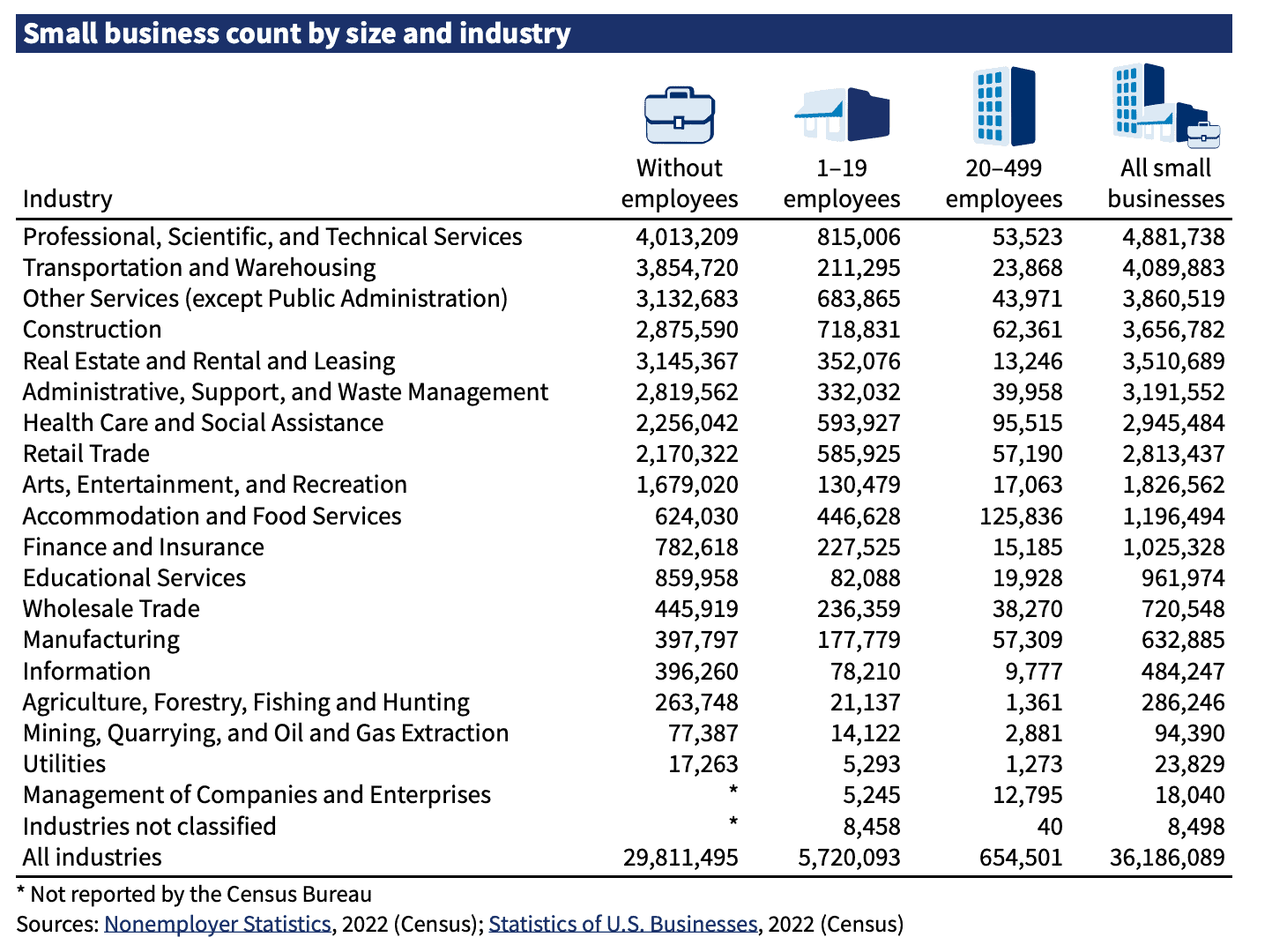
Demographics are destiny in survey data. A survey of “small businesses” that’s 70% businesses with more than 100 employees tells a vastly different story than one surveying small businesses with no employees or fewer than 5 employees. Yet both might be reported as representing “small business owners.” The SBA’s small business profiles show this diversity clearly.

Pay attention to:
- Geographic distribution (urban vs. rural makes a huge difference)
- Industry representation (service vs. manufacturing vs. retail) – cross-reference with NAICS codes
- Business maturity (startups vs. 20-year veterans)
- Revenue ranges (a $100K business and a $10M business are both “small”)
- Survey timing (December optimism differs from April reality).
The best surveys provide detailed demographic breakdowns. The suspicious ones aggregate everything into tidy headlines.
Lens 3: The Language Decoder
Words in surveys are compressed files. They contain far more information than their surface meaning. When business owners say “regulation” is a problem, they might mean:
- Specific compliance costs eating margins
- Frustration with paperwork complexity
- Fear of unknown penalties
- Resentment about larger competitors navigating rules better
- General anti-government sentiment
- Actual regulatory barriers to growth
Each interpretation suggests different solutions, different marketing messages, different ways to connect. Your job is to unpack the compression and understand the full file.
Lens 4: The Contradiction Compass
Contradictions in survey data aren’t bugs. They’re features. They reveal the messy reality of human psychology and business operations. When data points seem to conflict, you’ve found gold.
- Create a contradiction map. Plot seemingly opposing findings against each other:
- High optimism + high uncertainty = hope without confidence
- Labor problems + no wage concerns = expectation misalignment
- Good business health + sales worries = temporary stability anxiety
- Low inflation concern + persistent cost complaints = acceptance fatigue
These contradictions tell you how people really feel versus what they think they should say.
Lens 5: The Silence Scanner
What’s missing from survey data often matters more than what’s included. If a comprehensive small business survey doesn’t mention:
- Digital marketing challenges (they’re overwhelmed or oblivious)
- Cybersecurity (not on the radar until disaster strikes)
- Succession planning (too painful to contemplate)
- Mental health (stigma still strong)
These gaps reveal blind spots, taboos, and opportunities. They show you where education is needed, where pain exists but isn’t acknowledged, where future problems are brewing unrecognized. Resources like Pew Research often fill these gaps with their comprehensive studies.
The Persona Alchemy: Turning Data Into People
Raw survey data is just ingredients. The magic happens when you cook it into a living, breathing persona. Here’s how to transform statistics into someone you could have coffee with:
Start with the contradictions. Build a person who can hold opposing ideas simultaneously. Because that’s what real people do.
Meet Sarah: The NFIB Business Owner
Based on the August 2025 data, let me introduce you to Sarah, who runs a 15-person manufacturing shop in Michigan:
She’s optimistic about her business (because the economy finally feels stable) but still uncertain about external factors (because she’s been burned by supply chain disruptions and policy whiplash before).
She complains about labor quality while paying $19/hour for skilled work that commands $27 elsewhere. But she genuinely doesn’t see the connection. To her, it’s about work ethic, not economics. The tight labor market is finally showing signs of softening, but her expectations haven’t adjusted yet.
She rates her business health as “good” because 68% of small business owners now report their health as excellent or good (up 3 points from July). Her frame of reference is finally shifting from survival mode to cautious growth mode.
Sales worry her because one lost contract could sink everything, but she doesn’t mark it as her “biggest problem” because worry and problem are different categories in her mind.
This persona isn’t just a description. It’s decision-making fuel. Now you know:
- She’ll respond to messages about stability over growth
- “Work ethic” language resonates more than “compensation packages”
- Future-proofing fears motivate more than immediate gains
- Peer comparison drives her success metrics
The Marketing Transformation: From Insight to Impact
Understanding survey data transforms how you market. Instead of quoting statistics, you can now:
Speak Their Language: Don’t say “studies show labor challenges.” Say “Finding people who care as much as you do about quality feels impossible lately.” You’re acknowledging both the stated problem (labor) and the emotional truth (ownership mindset mismatch).
Bridge Their Contradictions: Create messages that hold both sides: “You’re right to be optimistic about your growth AND smart to prepare for uncertainty. Here’s how to do both…” This validates their complex reality instead of forcing false choices.
Fill Their Gaps: If surveys reveal blindspots, become the gentle educator: “While you’re focused on daily operations (labor, sales, costs), there’s a silent threat building…” Position yourself as the one who sees what they’re missing.
Mirror Their Metrics: If business owners define health as survival, don’t pitch revolutionary transformation. Pitch sustainable stability with upside potential. Meet them where they measure.
Your Survey Investigation Toolkit
Keep this framework handy for every survey you encounter.
The Survey Decoder Checklist
The Initial Scan:
- Who funded/conducted this survey?
- What’s their stake in the outcome?
- When was data collected?
The Deep Dive:
- What’s the actual sample size and demographics?
- How were questions framed exactly?
- What response options were provided?
The Critical Analysis:
- Where do findings contradict each other?
- What explanations make sense for contradictions?
- What’s notably absent from the questions or results?
The Translation:
- What’s the emotional truth beneath logical answers?
- How would respondents explain this to their spouse?
- What story makes all pieces fit together?
Real-World Application: The NFIB Labor Quality Example
Let’s apply this framework to a current example. The October 2024 NFIB report shows that 20% of business owners cite “labor quality” as their single most important problem, up 3 points from September. Meanwhile, only 8% cite “labor cost” as their top issue.
Surface reading: Business owners care more about skill than cost.
Deeper analysis: “Labor quality” is code. It means “I can’t find people who think like owners, work like I did when I was starting out, and accept what I can afford to pay.” But saying that out loud (even to themselves) feels uncomfortable. So “labor quality” becomes the safe harbor for a complex set of frustrations about changing workforce expectations, generational differences, and economic realities.
Marketing application: Instead of leading with “reduce labor costs,” try “find people who share your work ethic” or “bridge the generational gap in your workplace.”
The Meta-Truth About Survey Truth
Here’s the ultimate paradox: survey respondents aren’t lying, but they’re not telling the truth either. They’re sharing their perceived reality, filtered through ego, fear, hope, social acceptability, and the mood they happened to be in during those ten minutes of questions.
Your job isn’t to judge this messiness. It’s to understand it. Because somewhere between the optimistic headline and the uncertain details, between the stated problem and the unspoken cause, between what they say and what they mean, lives the actual human running an actual business with actual challenges.
And when you learn to see that human clearly (contradictions, blindspots, compressed language and all) that’s when your marketing transcends statistics and starts speaking truth.
Your Next Move
The next time someone shares a compelling statistic in your team meeting or industry newsletter, resist the urge to simply accept or reject it. Instead:
- Zoom out. Ask what other data points create this picture.
- Find the contradictions. Write them in the margins.
- Build the persona. Tell their story in first person.
- Speak their language. Use their words, address their real concerns.
- Bridge their gaps. Become the one who sees what they’re missing.
Do this consistently, and you’ll stop marketing to statistics and start marketing to the humans behind them. When you understand your audience better than they understand themselves, that’s when you win their trust, their attention, and eventually, their business.
The next time someone shares a compelling statistic, resist the urge to simply accept or reject it. Instead, zoom out. Ask what other dots create this picture. Build the persona behind the percentage. Find the human in the data.
Because ultimately, we don’t market to statistics. We market to people who sometimes become statistics. And understanding the difference? That’s where great marketing begins.
Fix It Session
$150.00
Send me one thing you’re stuck on in your business — a page, funnel, or offer. I’ll review it and send you a short video with clear feedback and next steps. No pressure, just a simple, actionable fix to get you unstuck.
