In This Article

Is your opt in form sleeping on the job? Even with so many awesome opt in form platforms and designs, it’s still hard to customize and optimize these opt in forms in a way that assures that you grab your ideal customers’ attention.
Usually, we spend a ton of time on our offers or our landing page designs. And there’s nothing wrong with that.
But, did you know that you can increase email subscribers by just tweaking your opt-in form? In this article, I’m going to share four ways that you can make right now to increase the number of opt-ins you get.
I get so many questions about what type of opt in form to use or what the best colors are for buttons. So I thought I’d answer them right here.
What fields to include in an opt in form
The highest converting opt in forms have two fields; name and email. The conversion rate of a form will drop by 20% for every form field that you add.
Think carefully about adding a phone number- because that field alone decreased opt ins by 48%. I would recommend that you only add a “phone” field if there is a good reason to contact the person such as confirming an appointment or sending a text reminder if they want to receive it.
If you have to ask for more info beyond the two form fields, include the word “Optional” in parentheses next to the extra form fields.
Simply adding “optional” in the field can increase the conversion rate of forms using more than two form fields.
How to label opt in fields to increase conversions
Another way to boost email opt-in conversions is to specify the call to action (what you want people to do) as part of the field.
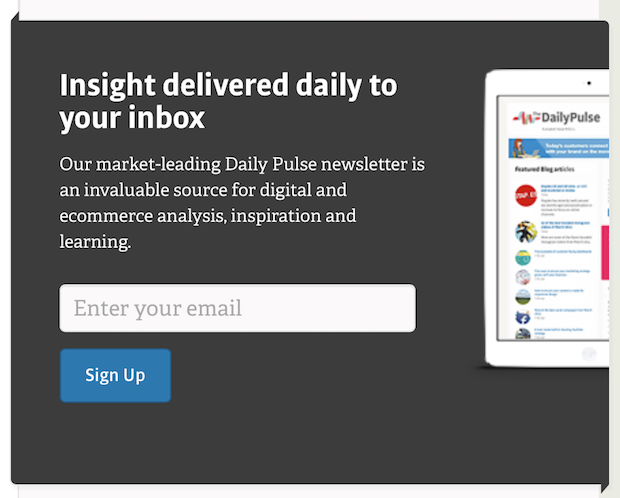
For example, where you want people to enter their email. Give them the direction “Enter your email here” either inside the field or next to the field.
What’s the best call to action button color to use?
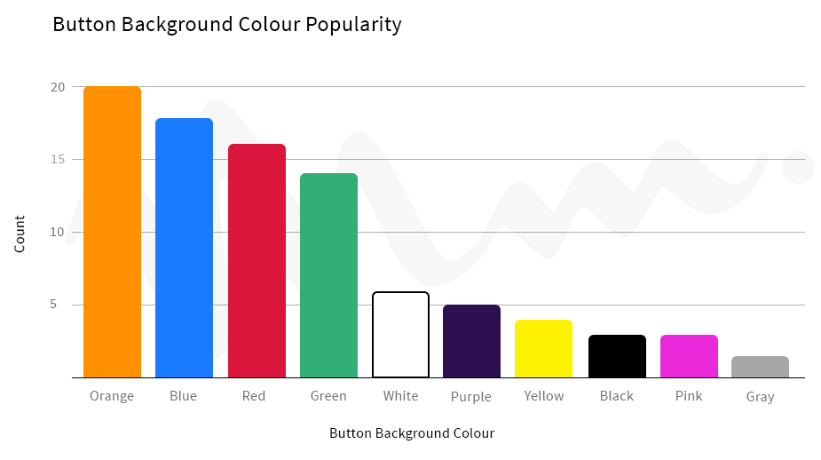
Historically, these are the most effective call to action button colors to use:

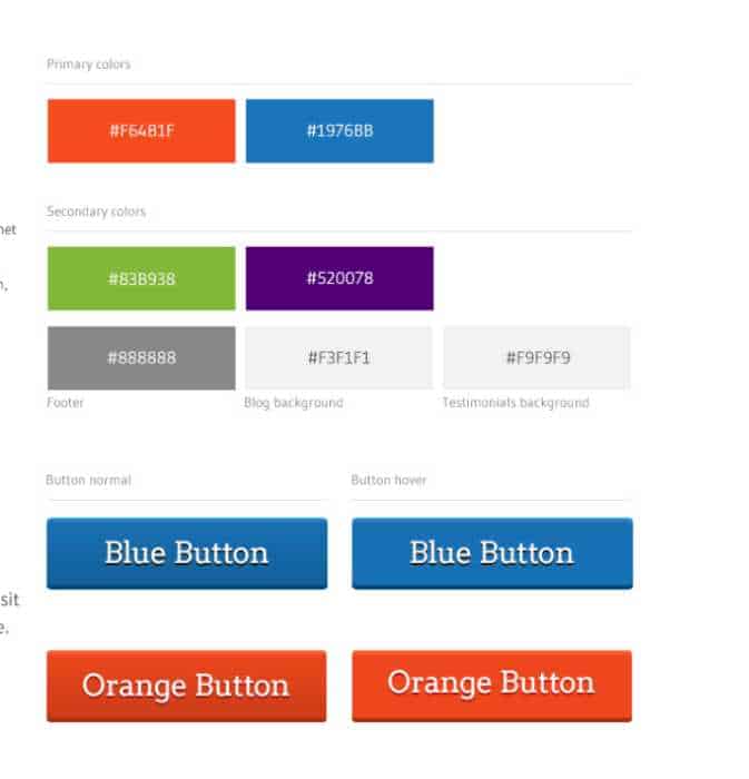
You don’t have to take these colors literally, use a variation that works with your brand colors.
Here are the button colors that match my brand colors as an example.

If your business targets primarily women or men, you can adjust your button colors based on the primary preferences for men or women.
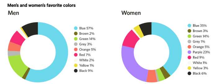
Joe Hallock studied the color preferences of men and women to help marketers figure out what colors to use on their buttons to appeal to certain audiences.
The top three color preferences by women are blue at 35%. Purple at 23%. And green at 14%. For men, the top three colors were blue at 57% green at 14% and black at 9%.

What opt in button text converts the best?
Now that you have the button colors ironed out, let’s look at what text to use inside the button that will increase your conversion rate.
Research shows that you should use 3-4 words inside the button text. Another tips is to make that text a command in the first person:
Here are some examples:
- Start my free trial
- Give me instant access
- Show me ___
- Try it free
- Save my seat
- Get my tickets
- Watch the replay
- Take the quiz
- Buy Now
- Download
What are the best call-to-action phrases?
The next element of your opt in form is the text or copy that’s designed to inspire the visitor to trade their email for what you’re offering.
Here are a few effective newsletter opt ins
- Get exclusive tips that I only share with subscribers
- Join over 1,000 subscribers
Short phrases like this are great for a single line opt in.
If you’re using professionally designed forms, you’ll find that many of them give you the option for a headline as well as some descriptive text.
Here are a few of my favorites:

You can create your own headlines using some of these formulas that I pulled from OptinMonster.
- How to [desired result]
- How to [desired result] for [audience]
- How to Get X [blank]
- Learn How to Get [desired result]
- [double/triple] Your [desired result] with [topic]
- Imagine [desired result]
- Ready to Start [desired action/result]?
- For People on the Verge of [blank]
- Are you in? XX,XXX others already receive [newsletter/lead magnet]
- X Secrets to [desired result]
- Quiz: What Kind of [type of person] Are You?
- Quiz: Find Your Perfect [blank]
- Free Access: The [blank] Community
- [unique value proposition] (Try it Free)
What’s Next?
If you want to increase your email opt-in conversions, it’s important to test different forms and copy to see what works best for your audience. The research shared in this article should help you get started. Try out some of the tips and tricks mentioned here, and see how they can help you grow your business.