In This Article

If you’re struggling with HTML vs plain text emails, you’re asking the wrong question.
Plain text messages are more likely to reach their target inbox and HTML emails give you better data.
So what?
The real question is, how should your emails look to get the best return on your marketing?
Your emails should do the job they were sent to do:
- get delivered
- get opened
- get read
- connect with the recipient
- build relationships with the recipient
- inspire the desired action (click or reply)
What your email looks like is determined by who your recipient is, how they engage with email and how you can make it as easy as possible for them to get what they want with as little effort as possible.
In this article, I’m going to give you the guidelines I use to match the email to it’s marketing purpose. And here’s the best part — there’s data for that. So by the end of this article, you’ll feel much more certain about whether your emails should be HTML, text or both.
Why HTML vs Plain Text emails is even “a Thing”
In the beginning, emails were plain text. And, like all things plain, they got the job done, they didn’t take up much thought and space and they left room for a lot of “pretty.”
HTML made it possible to add sizzle to your email.
You could add hyperlinks.

you could add images, colored boxes, embedded video and more. Everything you could do on a website, you could send in an email.
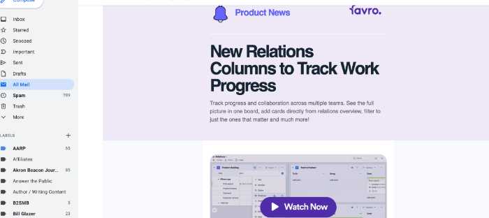
And, every time some technology gives us sizzle — it’s tempting to add sizzle all over the place. But if you do, don’t be surprised if you get burned.
Send Emails That Look Like They Came From You to the Reader
If you’re truly working on the goals of getting emails delivered, opened, read and engaged with, then the whole HTML vs Text email choice is kind of irrelevant.
Every email you send is being read by an individual not by a group of people. If you were to send an email to ONE person, you’d send it from your regular email (Gmail, Outlook, etc).
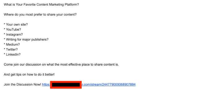
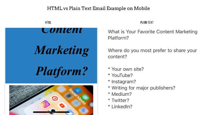
Which of the emails below looks MORE like it came from you to me?
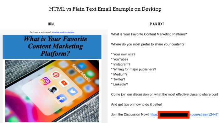
Both of these emails say exactly the same thing, but they “feel” very different.
The one on the left looks like a magazine article maybe, or it looks like it went to thousands of people. It’s asking me a question, but I don’t feel like I have to answer, after all, thousands of people will get this and they won’t miss my vote.
The one on the right says exactly the same thing, but it just feels more personal. It feels like a personal invitation.
Make Sure That I Can Understand the Message on a Mobile Device
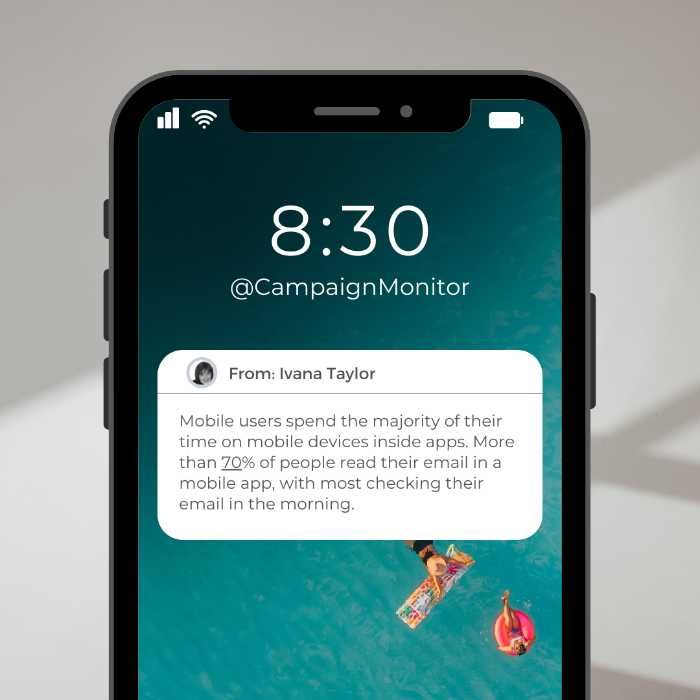
(source: Campaign Monitor)
If you have an email list of 1,000 people and 400 of them open an email you sent, 320 of them will have seen it on mobile.
Which of these emails would you open?
Make It Easy For Me to Do What You Want Me to Do
Every marketing email should aim for a SINGLE action to take.
- Click on a link
- Reply to the email
- Make a call
When you get down to basics, there are only three basic actions you can ask people to take. PICK ONE.
What is the ONE thing you want them to do.
If it’s to click on a link — then you can place several hyperlinks in your email that all go to the same place.
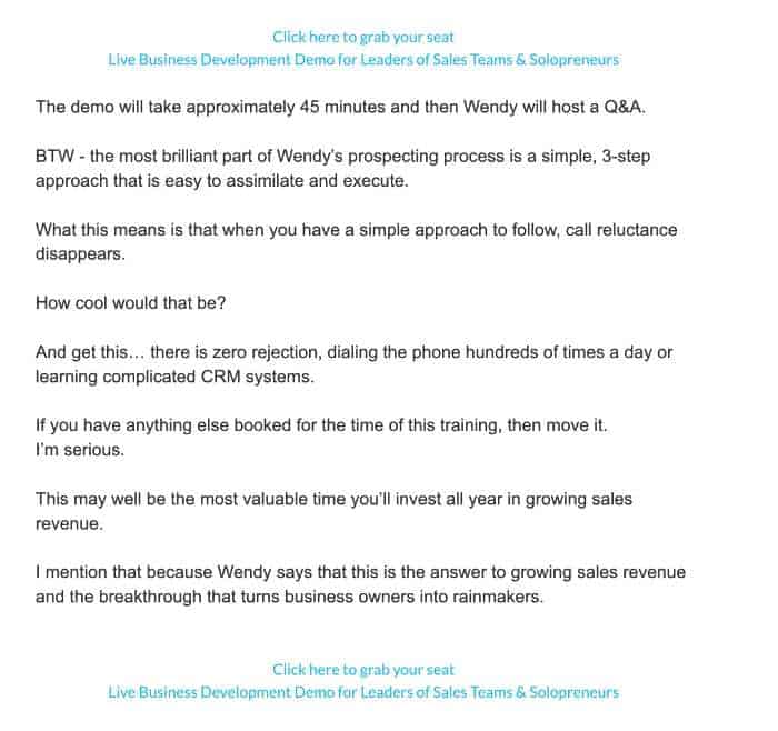
In this example there are two calls-to-action that are exactly the same and all going to ONE place. The ONE thing I want them to do “Click here to grab your seat”
Send HTML Emails That LOOK Like Plain Text
All of this comes down to the only obvious answer to which is better HTML or Text emails — BOTH.
And, the good news is that sending an HTML email that looks like plain text is the easiest thing to do, you can do it on every email marketing system and you don’t have to think about it.
Check this out —
I sent this email from Kartra (my marketing automation tool).
But I wrote it to YOU.
I’m sharing this sample from my mobile device so that you can see the true benefit of sending a plain HTML text email.
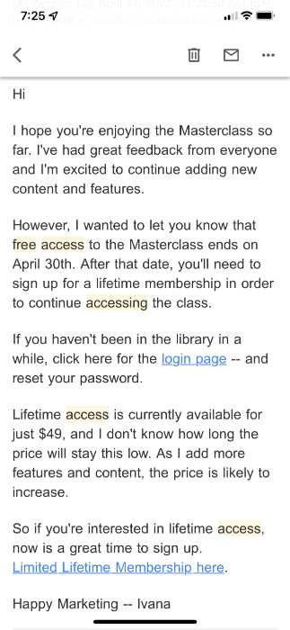
Here are a few things I want you to notice
- I can read the entire message on a single mobile screen.
- I’m giving you everything you need in a single email a login recovery so you don’t have to search for it and a call-to-action to get access to a membership.
- I wrote it to YOU
- I’m not selling, I’m informing.
You Don’t Have to Choose Between HTML and Text Emails
Bottom line, don’t choose between HTML and text emails. Do both.
Write an HTML email with text. This will increase your deliverability and make it easy to scan and read on a mobile device. Not only that, but it will create a personal connection between you and the reader.
Use multiple hyperlinks leading to the same destination. This way, the reader only has one action to take and can click your link when they are inspired to do so.
Finally, if you keep your focus on the reader, write to a single reader as a friend and a trusted source, you will see your email engagement and your ROI go UP!