In This Article

Visual content dominates content marketing today. The era of large blocks of text with little or no visuals is now a thing of the past.
Humans are visual learners, and it is visual content that tends to go viral. According to research by PR Daily, visual content gets viewed 94% more than bland content with no visuals.
Blog posts will remain central to content marketing, but it is visuals that will make your content more appealing to your readers.
Visual content includes images, videos, memes, slideshows, and infographics. However, infographics are the visual communication medium we will address in this article.
An infographic is a visual presentation of information in a format that includes images, charts, and limited text. Infographics use attractive visuals to communicate information quickly and clearly.
This makes it easier for your readers to digest your content as opposed to scanning through large chunks of text.
Why Use Infographics?
The usefulness of infographics as a visual medium is clear, but you may need more conviction before taking the plunge. There are many reasons to adopt infographics in your content marketing and some of them are:
Infographics break down complex information and make it easy to digest.
Readers will prefer scanning through a visually compelling infographic than reading lengthy texts.
Infographics make it easy to relay facts and figures which position you as an expert in your niche.
People love facts, and infographics make it easy to communicate these facts through attractive graphics and images
Infographics are easily shared and have a greater tendency to go viral than text content.
The attractiveness of infographics makes them perfect for online sharing on social networks. Viral content will not only boost your SEO but also generate awareness for your brand
Viral infographics will drive traffic to your website.
When your readers like and share your linked infographics, more people will link to your website and become aware of your products and services.
You are now aware of the benefits of infographics to your content marketing strategy, but how can you create an infographic?
How To Create Your Own Infographic
We are not all masters of design, and you may hastily conclude that you lack the design skills to create an infographic. This is not true.
Many free and paid infographic tools are intuitive and these tools make creating an infographic a breeze.
Making an infographic is easy, and we will show you how in the step-by-step guide below:
Step 1: Establish What You Want To Achieve With Your Infographic
The goal of your infographic will determine the design elements you will use and the words you will include in the copy of your infographic.
Whether you are trying to relay complex data to your readers, present a quick overview of a blog post, or display the results of a survey, the goal of your infographic will shape your design approach.
Step 2: Define The Audience For Your Infographic
The target audience of your infographic will also shape how you visualize the information on your infographic. The choice of graphics, color, and tone of the copy of your infographic will be determined by what appeals to your target audience.
You should check out your competitors to see the infographics they are using. Infographic designs that get a high number of shares will be a safe bet, and you can also tell what’s not working with infographics that get little engagement.
Step 3: Curate Your Content And Organize Your Data
You have established the goal of your infographic and you know the ideal readers of your infographic, the next step is to collect the information you will need to tell your story.
The first thing is to choose a topic for your infographic. Choosing a topic helps you to define the theme of your infographic. It serves as the backbone of your story and helps to focus your research.
Next, you will collect data relevant to your topic. Presenting data for the sake of data will add no value to your audience and may impair the effectiveness of your infographic.
You can use your data, third-party data, or a combination of both. Fact-check your information and be sure to cite the sources of your data.
Step 4: Choose The Right Infographic Template For The Data You Want To Present
Infographic design tools come with a variety of templates for you to choose from, and you must choose a template that works best for the information you want to present.
Some of these templates are:
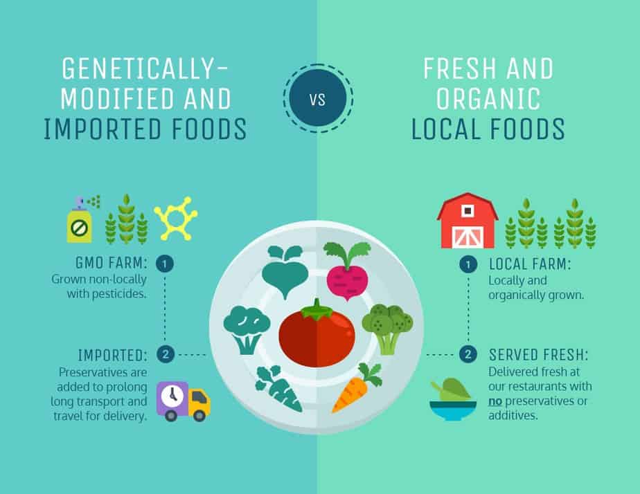
The Comparison Infographic Template
Source: Pinterest
You can use this type of template to place two concepts or products side-by-side and explain their differences. This template allows you to create contrast and lays out the advantages and disadvantages of one concept in relation to the other.
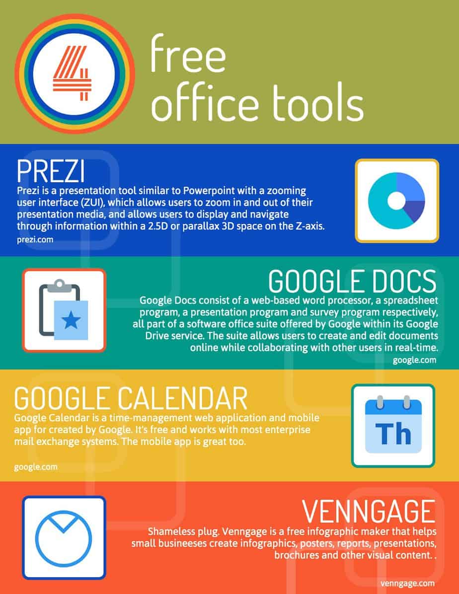
The Informational Infographic Template
Source: Venngage
This is a more text-heavy type of infographic, but the text is complemented with graphics like icons, colors, fonts, and other visual elements. You can use informational infographics to create listicles, how-tos, or an overview of a blog post.
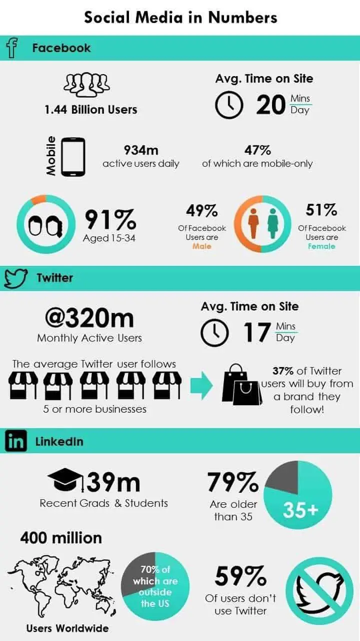
The Numbers Infographic Template
Source: Advertisingrow
This type of infographic is perfect for displaying statistical information. It allows you to display data in easily digestible numbers and in a visually attractive way.
- Timeline Infographic. A timeline infographic can be a simple, appealing way to correlate events with time. They are a great choice for communicating history or progress of projects and initiatives, and are easy to adjust to any time scale.
- Business Infographic. Almost any infographic template or design can be used to create a business infographic. Businesses can use infographics in internal communications and newsletters, in presentations and new business development, in marketing and advertising, and almost anywhere else where complex data can be presented in a simple, appealing way. Business infographics are usually designed to reflect the company’s brand, using brand fonts, colors, and style guides to create infographics that are visually harmonious with other brand materials.
- Interactive infographic. Adding even simple interactivity or animation to an infographic is a great way to increase interest and engagement. It can also be a powerful way add layers of data, reflecting changes over time, impacts of different variables, or revealing different outcomes. Sites like Infogram and Visme make it easy to create your own animated or interactive infographics.
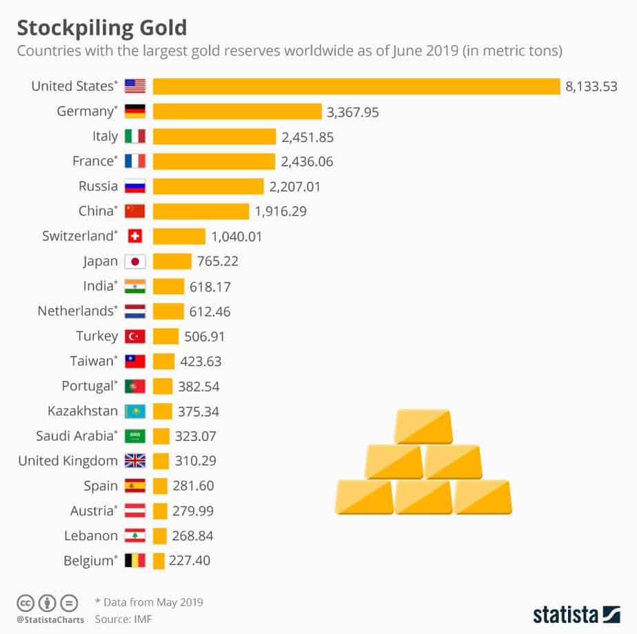
The Charts Infographic Template
Source: UsaToday
Chart infographics are also used to display statistical data.
However, they are more suitable for comparing a large number of items. Pie charts infographics in particular are quite common.
Step 5: Design Your Infographic
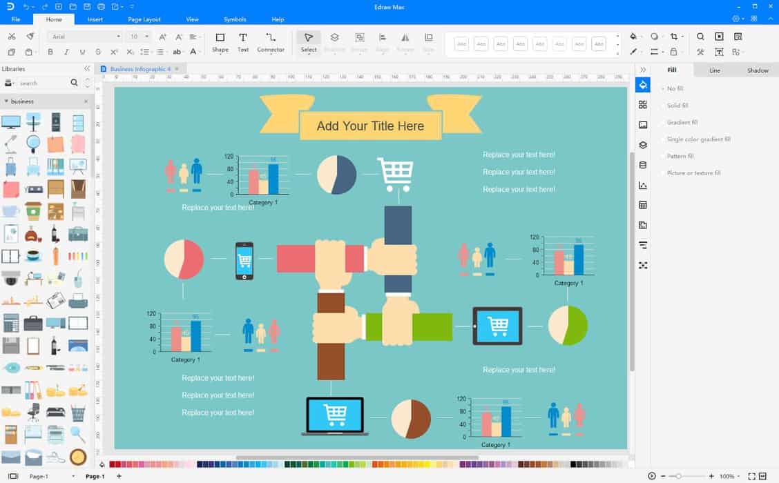
Source: edrawsoft
This is the fun part. It is the stage where you input your topic, data, and select graphics and colors into your infographic template.
So how do you design your infographic?
- Launch your infographic design tool
- Select an infographic template
- Choose the appropriate size for your infographic
- Add your data to the content placeholders of your infographic template
- Add icons, images, and other graphical elements to your infographic
- Set the colors, fonts, and backgrounds for your infographic
- Review your work
- Save and download your completed infographic
Step 6: Promote Your Infographic
If you want your infographic to get shares and go viral, then you need to promote your infographic. The process is similar to how you promote your blog posts. Make your infographics shareable, promote your infographics on your social media accounts, and watch it explode in popularity.
Best Infographic Makers You Can Use To Create Your Infographics
To help you get started with creating your infographics, we have identified the best free and paid infographic makers out there. These infographic makers will provide you with all the tools, templates, graphical elements, and resources you need to create any type of infographic.
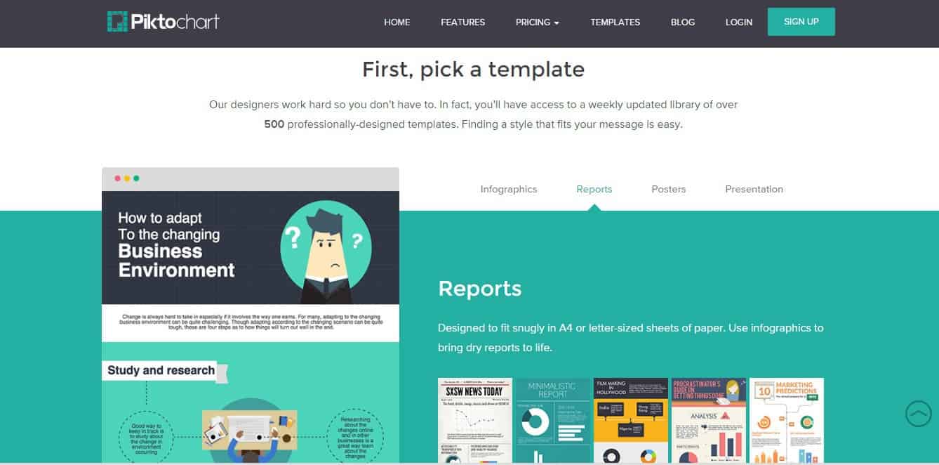
Piktochart (Free)
Source: blog.drumup.io
Piktochart is a free infographic maker perfect for people with little or no design experience. There is a wealth of templates on the platform and it features a drag-and-drop interface that lets you add graphical elements to your infographic with ease.
Canva (free)
Source: Causevox
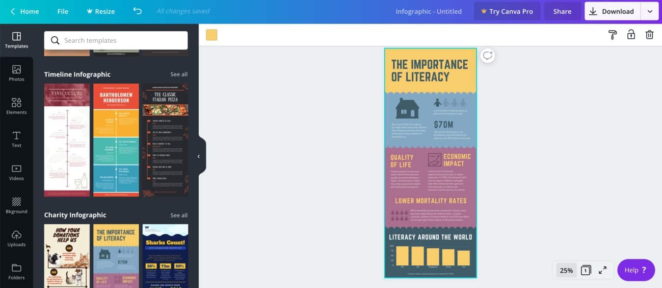
Canva is one of the most powerful design tools you can find online today. It allows you to design just about anything from brochures to birthday cards. You can also create infographics for free. The Canva infographic maker is easy-to-use, and you will have access to a massive library of fully customizable templates, images, color schemes, and graphical illustrations – both free and paid.
Venngage (free)
Source: iconscout
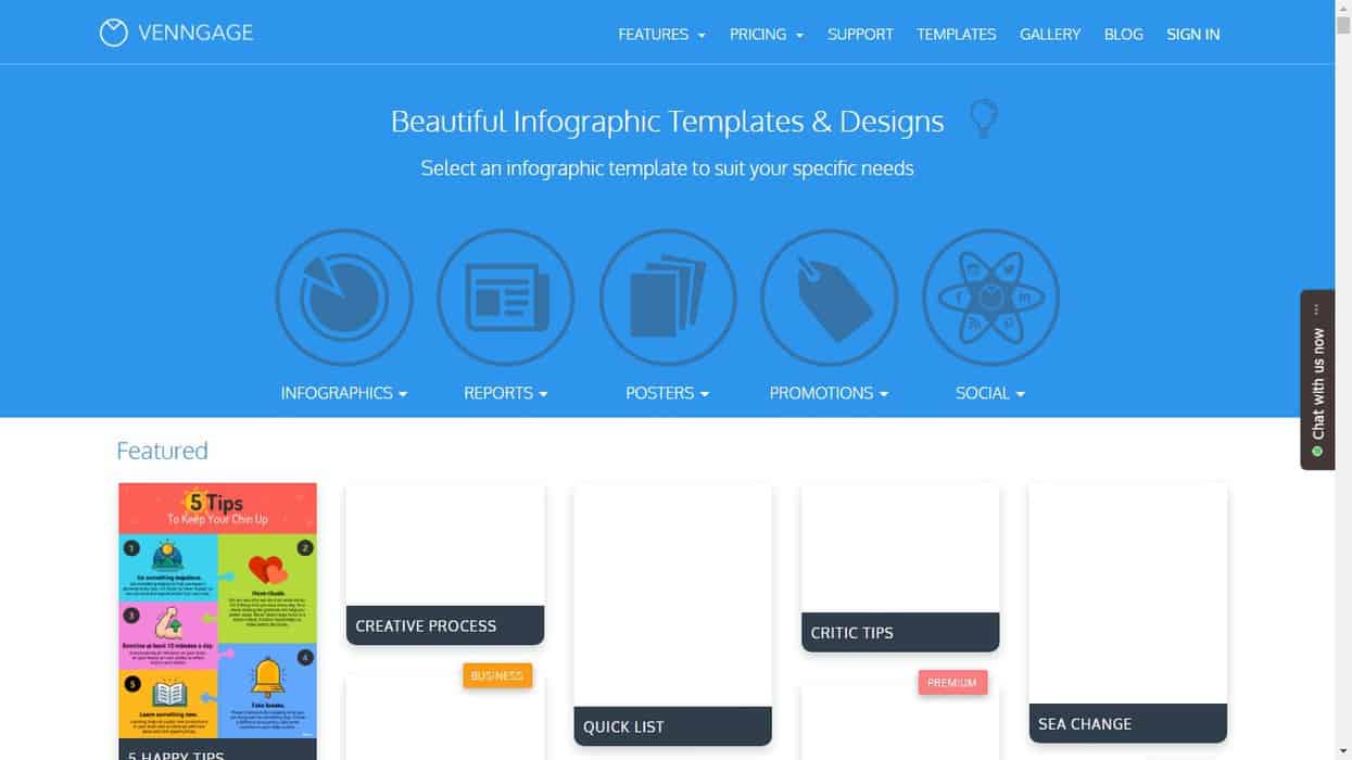
Venngage offers 100+ infographic templates for you to choose from, and you can easily create infographics for social media, data presentations, reports, and more.
Adobe Spark (free)
Source: helpx.adobe
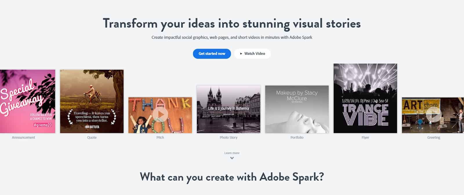
Adobe Spark lets you create stunning infographics quickly and easily. It comes with a drag-and-drop editor that is equipped with a library of thousands of templates and graphical illustrations. The platform is particularly ideal for creating infographics for social media, and it comes with a handy feature that lets you set the appropriate infographic size for your favorite social media platform.
Google Charts (free)
Source: Computerworld
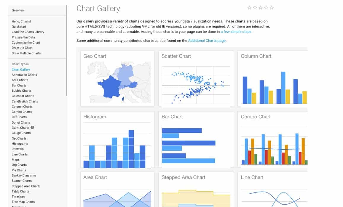
With Google Charts, creating colorful charts to present your statistical data is easy and free. You can select from a rich gallery of highly customizable charts and connect to your data sets in real-time.
Easel.ly (freemium)
Source: Templatetoaster
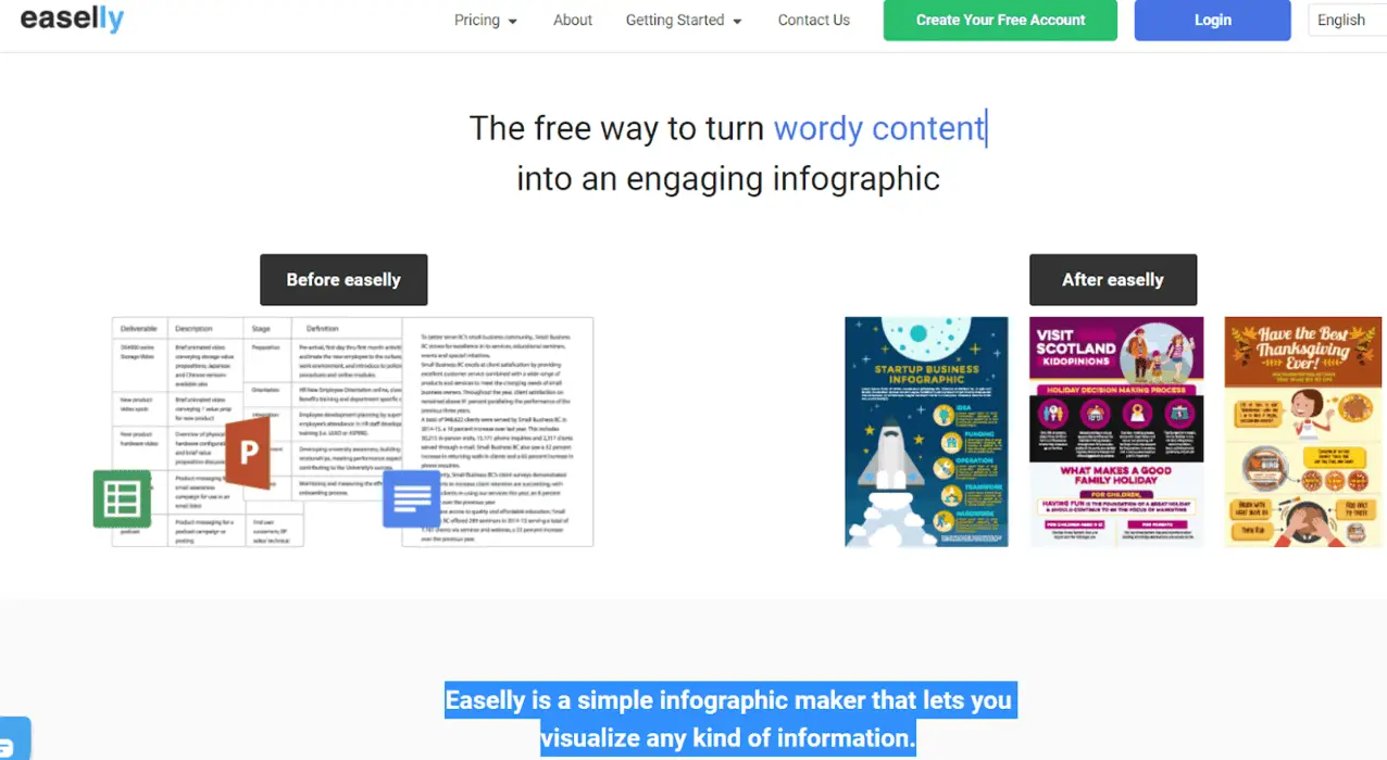
Easel.ly makes it easy to create beautiful infographics by picking from its hundreds of categorized templates. It also comes with a drag-and-drop editor with which you can easily swap in graphical illustrations, change colors, choose between font styles, and upload your images.
Snappa (freemium)
Source: Buffer
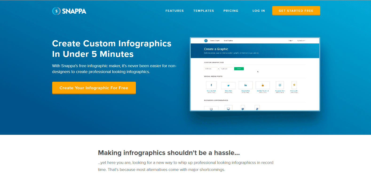
Snappa comes with a fully-featured graphics editor with which you can easily resize pre-made templates for social media, ads, emails, infographics, and more. The platform also allows you to schedule and share your infographics directly to social media.
Genial.ly (freemium)
Source: Commonsense.org
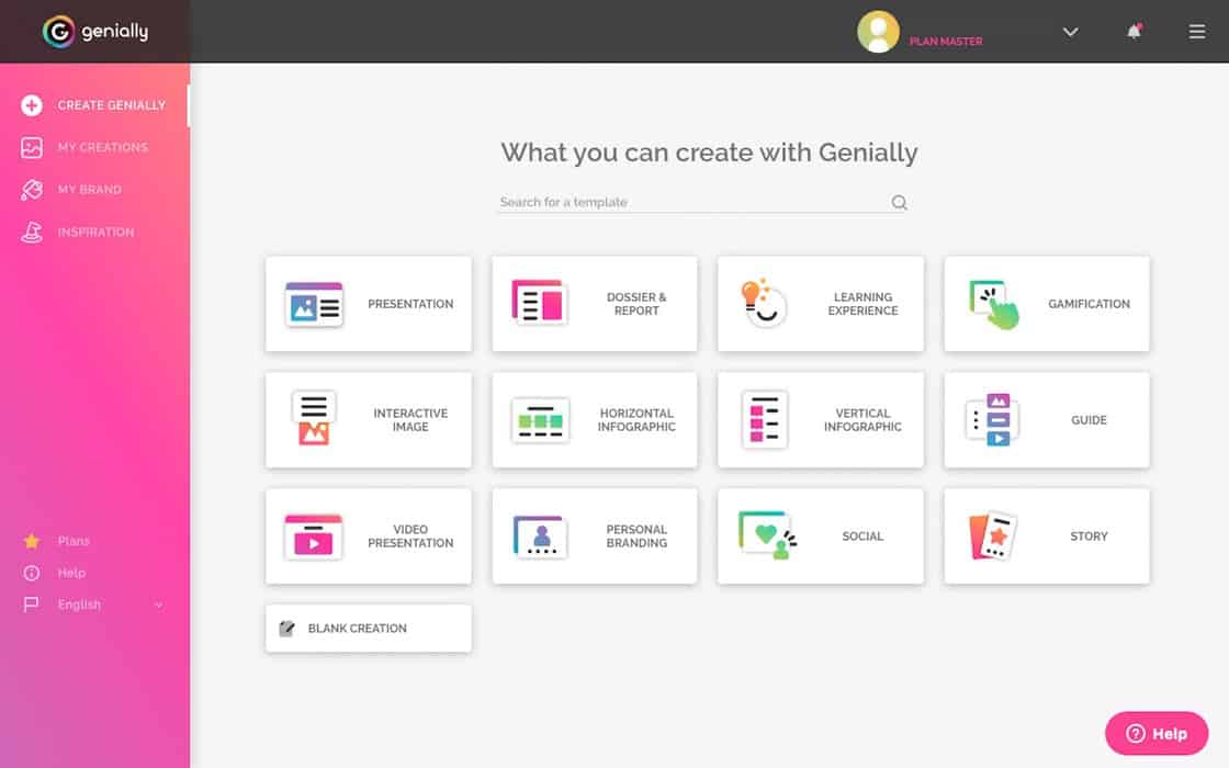
Genial.ly is an online data visualization tool that offers an easy-to-use editor with which you can add shapes, images, and other graphical illustrations to your template. It also works on the cloud, so you can access your infographic from any device. However, the free subscription prevents downloading, and you can only share your infographic directly to social media.
BeFunky (premium)
Source: Buffer
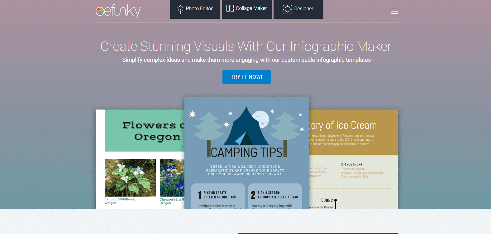
This is one of the best online tools for creating attention-grabbing infographics that get the reader engagement you need. The tool comes with over a million stock images, thousands of pre-made professionally designed templates, and hundreds of design elements.
Visme (freemium)
Source: Pinterest
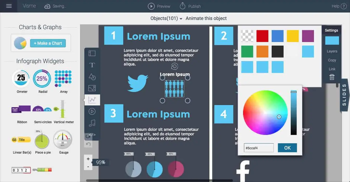
With Visme’s drag-and-drop editor, you can create beautiful infographics in minutes. The editor comes with a library of pre-made design assets that you can easily add to your template. You will get access to free fonts, hundreds of templates, and thousands of images and icons.
Best Information To Put On An Infographic
There are some tried-and-true design elements that you should include in your infographic and some of them are:
Relevant And Verified Data
Readers love visual content, but that visual content must also relay information relevant to the topic of the infographic and useful to your readers. The information must resonate with your audience, and your data must be up-to-date. Using outdated data will create the wrong impression and can harm your brand.
Stunning Graphics
Visual design elements are the beauty of infographics, and the graphical illustrations you use should be attractive and appropriate for your audience. Use the right colors, fonts, and icons that will resonate with your target demographic of readers.
Coherent Organization Of Data
The key to a successful infographic is a perfect balance of text and graphical illustrations. Your readers should be able to understand the message of your infographic in a quick scan. If your infographic design is chaotic, it is difficult to get reader engagement.
How To Brainstorm Ideas For Your Infographic
It is easy to identify your competitor’s trending infographics, but you can’t just copy it, you need to come up with novel ideas for your infographic.
To help you source ideas, we have compiled a list of tried-and-true ways to brainstorm great infographic ideas.
Repackage Your Existing Content
If you have invested heavily in content marketing over the years, then you can harness your blog posts, press releases, and case studies to create your infographic. All you need to do is trim the content into a visualized and easily digestible infographic.
Company Data
You can showcase your unique accomplishments and differentiate yourself from your competitors by using credible data to tell your story with a Numbers Infographic Template or Charts Infographic template.
Academic Studies And Government Reports
You can use publicly available academic research and public data to get the stats you need for your infographic.
Trending News In Your Niche
You can use a free tool like Buzzsumo to find trending articles in your industry. All you need to do is enter a keyword, and Buzzsumo will relay the articles that are getting the most social media engagement for the keyword. You can use this as inspiration for your infographic.
Surveys
Why not ask your readers? You can use a tool like SurveyMonkey to poll your readers and get valuable data on what your readers think and the type of content that will resonate with them.
Design Principles for Infographics
If you don’t have a background in graphic design, don’t worry. You can still create great-looking infographics, following a few simple rules. Here are the basic design principles for infographics:
- Color. If you’re wondering how to pick colors when you design an infographic, here are a few color principles to keep in mind:
- Brand. Does your brand already have a color palette that is preferred? Should your infographic be consistent with other branding materials and use the same color palette?
- Match, tint, and compliment. When you look at a standard color wheel, the basic rule is that colors that are next to each other match, while colors that are directly across from each other are complementary. You can also use a single color, and then tint it lighter and darker to get three colors that naturally go well together and don’t add unnecessary visual complexity.
- Feeling and emotion. Will the color palette of your infographic match the emotional tone of the data it conveys? It makes sense to use playful colors when your infographic is about happy, cheerful topics, but bright colors don’t go with every type of information. Consider whether your colors are consistent with the information you are conveying.
- Data visualization. When designing an infographic, remember that the primary goal is to communicate information in an appealing way, and color can be a powerful tool to help visualize data. For example, we naturally associate the color red with heat or urgency, so creating a chart or graph where urgent or important data is colored red helps to communicate the message. On the other hand, if a bar chart is indicating a single value or measurement over time, keeping every bar the same color makes sense, and creating different colors might be confusing. For eye-catching infographics that communicate clearly and effectively, choose a limited color palette with only 1-2 colors, or a single color with shades and tints, and then add additional color only if it’s needed for additional impact.
- Typography. Many people are confused about which fonts to use in an infographic. If you want to know how to pick fonts for your infographic, here are the key factors to consider:
- Brand. Does your brand already have a type style? Do your brand guidelines include fonts and usage?
- Legibility. The most important consideration when choosing fonts for an infographic is legibility. Your information needs to be clear, and labels need to clearly indicate the data they represent. Choose fonts that can be read at a glance, and place and style them for clarity and legibility.
- Serif or sans serif fonts: The rule of thumb for typography in design is to use no more than 2 fonts in a single design, and combine a serif and a sans serif font. Because sans serif fonts like Arial and Helvetica are more legible, it’s a good idea to choose a stylish serif font for your titles and headlines, and a more legible sans serif font for smaller labels and text blocks.
- Graphic elements. Graphic elements are a great way to make infographics more legible and more appealing. When choosing graphic elements for an infographic, here are the key design factors:
- Concrete or abstract? Is your infographics about a concrete subject like vegetables or mobile devices, or is it about something more abstract like customer turnover or public sentiment? You can choose graphic image elements that directly indicate concrete subjects, but it can be more difficult and confusing to try to use images to reflect abstract concepts.
- Keep it simple. Use simple graphic elements that can be quickly understood. Simple graphics like smiley faces, dollar signs, arrows, and shapes are usually more effective in an infographic than complex designs.
- Add clarity with your graphics. Graphics are a powerful way to enhance the visual appeal of your infographic, but they should always add clarity first. For example, lines, circles, and arrows can visually separate or connect different concepts, indicate changes or the flow of information, or group information together visually. Combine graphic elements with your color choices to organize information and add clarity.
- Negative space. Negative space makes an infographic look clean, organized, and professional. It sets apart different data sets, helps to focus and organize information, and makes an infographic easier to read and understand. Avoid cluttering an infographic design with too much information, elements that are too large or too close together, or too many colors, fonts, or graphic elements. Give the design room to breathe.
- What is the best size for an infographic? The best size for an infographic depends on what it contains, where it will be shared, and the target device of the user. Every social media platform has their own preferred image size and orientation, For maximum versatility, design your infographic with a vertical orientation, and use these popular sizes:
- Blogs and web pages: Vertical orientation. 800-1920 pixels wide x any length
- Social media:
- Square orientation (Instagram): 2000 x 2000 pixels
- Horizontal orientation (Twitter, LinkedIn, Facebook): 2000 x 1000 pixels
- Vertical orientation (Pinterest): 735 x 1150
- Print: Use CMYK colors, size your digital canvas by paper inches or milimeters, and use the highest resolution possible.
Good infographic design tools and apps will have templates that allow you to create infographics at the optimal size, and scale them for different platforms.
Types of Infographics That Get Shares and Go Viral
A beautiful infographic that contains relevant information and is promoted on the right social media channels stands a good chance of going viral.
However, not all infographics are created equal, and there are certain types of infographics that have proven to be more successful at getting engagement from readers.
List-Based Infographics

Source: European-business.com
Readers love listicles, they are easy to scan and digest. A well designed list-based infographic will include short texts, generous white space, and dynamic colors.
Comparison Infographics
Source: business2community
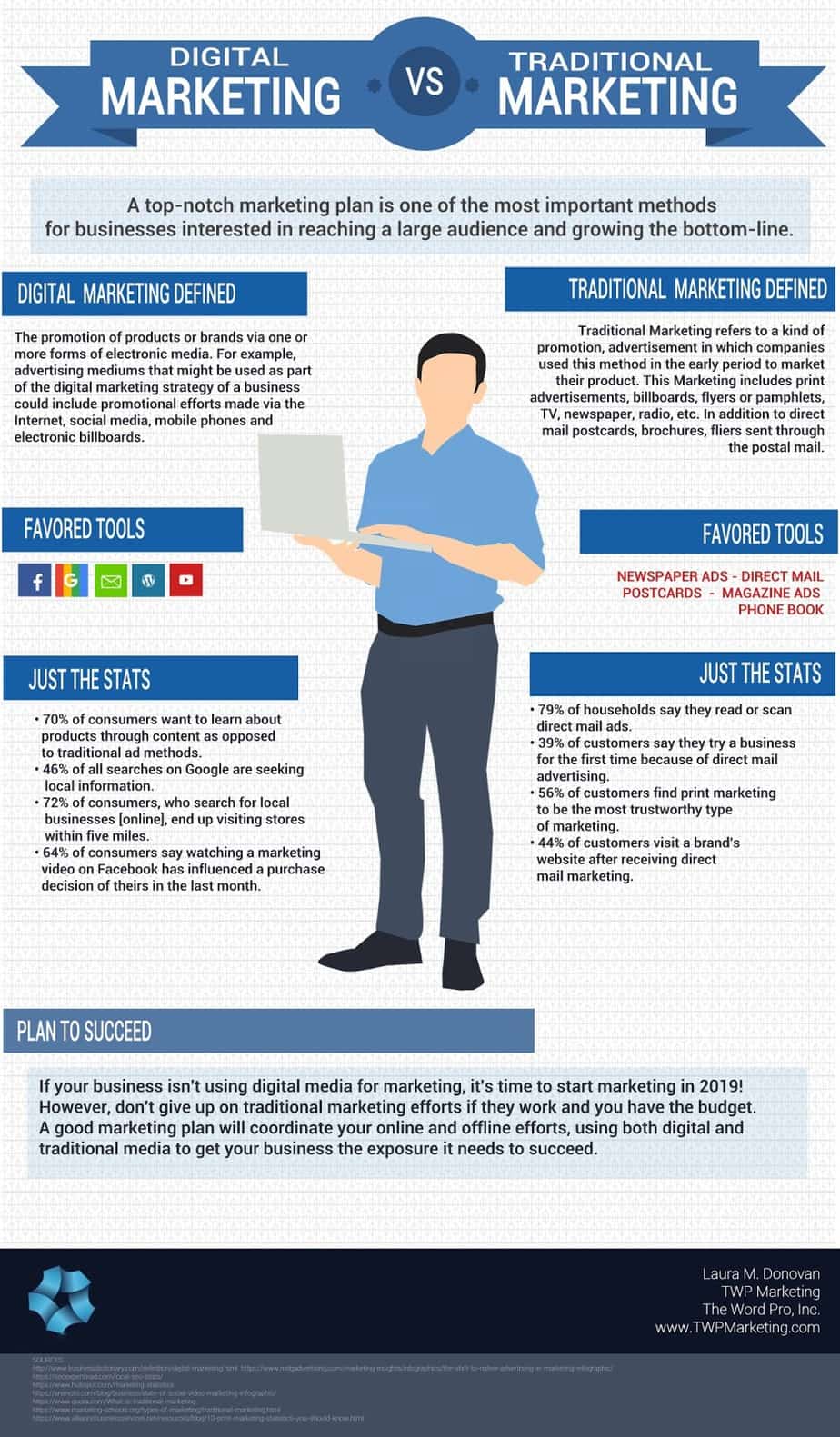
Comparison infographics make it easy for your readers to evaluate options and make decisions. Comparison infographics simplify the purchasing decision-making process for your readers, and your readers will love them.
How-To Infographics
Source: adioma.com
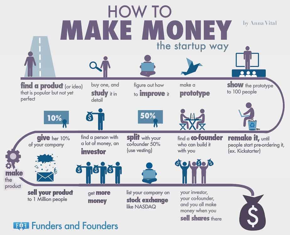
Who doesn’t love a How-To guide? How-To blog posts have proven to be extremely popular, and the same applies to infographics. You can use the How-To format for a range of topics, and the inherent value a How-To guide provides makes them the perfect viral infographic.
Chart Infographics
Source: weforum
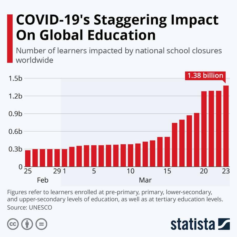
Infographic Charts allow you to present statistical data in a visually appealing format. Chart infographics work well on social media because complex data is broken down into shapes and numbers easy for readers to process.
There are several different types of chart infographics that can present information and data in the most visually effective way. Some of the most common infographic chart types include:
- Bar chart. Bar and column charts are an excellent choice for data-driven infographics that show comparisons of different items, or reflect change over time. They are also a great choice when you need to include quantities below zero. They reduce clutter when managing large numbers, and quickly visualize key information.
- Bubble chart. A bubble chart includes all the data captured in a traditional scatter graph, along with key information about quantity or volume, as reflected in the size of the bubbles. When designing a bubble chart, use circular shapes only, and scale your circles by area, not diameter, so that information is visualized accurately.
- Donut chart. The donut chart is a variant of a pie chart, and is a great way to indicate percentages and proportions. A donut chart has negative space in the center, which can be used to add labels or text, or simply to give the infographic a more sophisticated design.
- Interactive chart infographics. Making interactive charts in PowerPoint or Excel is fairly simple, and is a great way to present your data and calculate variables in real time. In the past, if you wanted to create interactive charts for your website or social media channels, you needed Javascript. Today, there are a number of great online tools, like Visme or everviz, that will allow you to easily design and publish interactive or animated charts that bring your data to life.
It’s Time To Create Your Own Infographic
We put together this guide to show you the importance of infographics to your content marketing efforts, and how you can create visually appealing infographics that will resonate with your readers.
Now, it is up to you to get started with any of the tools listed above and create beautiful and engaging infographics that will promote your brand and drive traffic to your website.
